Why Go Responsive?
People are increasingly using their mobile devices to browse and buy while on the go. Smart businesses should recognize this trend and capitalize on it. Providing a great experience on mobile devices is critical for a successful website. If your website isn't mobile-friendly, you risk losing traffic, visitors, and ultimately business. Simply put, if your website is not mobile-friendly, it is obsolete.
One For All
Build a desktop website and a separate mobile-version website is totally unnecessary. Such a setup is difficult to maintain, requires double the effort to update, and still doesn't account well for tablets and everything else in between. There's too many different devices and screen sizes to possibly attempt to account for each individually. And there's more arriving everyday. The only way to accommodate all devices is to build your website fluidly and adaptable to perfectly present itself regardless of the device it's being viewed on.
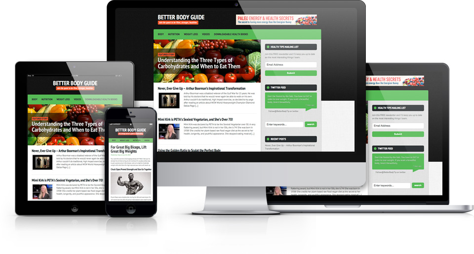
Responsive web design is a way of making a single website that works effectively on both desktop browsers and the plethora of mobile devices. Responsive design allows a superb browsing experience whether on a smartphone, tablet, or desktop computer.
Responsive design enables a website to optimize its layout to accommodate any screen size. With Responsive design, you can now reach your entire multi-device audience through a single website, saving significant development and maintenance costs compared to building native apps or dedicated mobile sites.
Responsive designs also maintains the integrity of your Search Engine Optimization (SEO). Your content is not duplicated across multiple versions of your website, nor is it hidden and inaccessible within an app. You have one site for all devices. Update one, update all.
Mobile Users Have Different Needs
People who browse on-the-go have different needs than those sitting at a desk. Repsonsive websites re-organize themselves automatically according to the device viewing them. Desktops get a full-blown interface, while smartphones see a simplified finger-tappable interface.
Mobile environments require simpler navigation, focused content, and fast page loads. The site may reduce the amount of content presented to the mobile visitor, so it has less clutter and is easier to use. Responsive design can offer a more app-like experience for mobile and tablet visitors without having to actually build a separate app version.
Future-Proofed
Responsive design is future-proof. Countless new devices are released every year. It's impossible to test for all of them. Responsive design is fluid and adaptable so that your site will work on any device right away.
The website automatically adjusts according to the device's screen size, and orientation. Large or small, landscape or portrait; responsive sites switch between these on the fly. Try resizing this page right now!
Whatever your hand finds to do, do it with all your might. Ecclesiastes 9:10
© 2026 All Rights Reserved
the browser